
Designing a seamless gym booking experience
Company
Core
Role
Product Design UX Research
Team
1 PD (me), 1 PM, 2 SEs
Duration
4 weeks
01 Overview
During the peak of COVID-19, gyms faced sudden closures and an urgent need to rebuild customer trust to reopen safely. This project focused on redesigning a gym chain’s website experience to support reopening by clearly communicating updated safety protocols and enabling a seamless online booking system for limited-capacity workout sessions. Through user research, usability testing, and iterative design, I delivered a solution that reduced booking friction while helping members feel confident returning to the gym.
02 Context
With capacity limits and social distancing, gyms shifted from walk-ins to reservation-based access. Existing booking flows were clunky, required repeated logins, and lacked clear time-slot visibility. Research revealed users needed transparent COVID updates and a fast, intuitive booking flow—including calendar-based availability, browse without login, and social sign-in. These insights shaped both the workflow and full website redesign.
03 The Problem
Reopening safety concerns
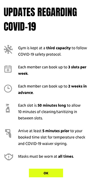
Customers didn’t know what COVID protocols would be in place, so they needed clear guidance before deciding to return
Lack of capacity control
With limited capacity and no walk-ins, the gym needed a reliable system to manage reservations and enforce distancing rules
No booking system
The existing website/services weren’t built to support a seamless time-slot booking flow, which became essential for reopening
04 Research
I conducted remote interviews with 12 gym members who recently booked sessions online to understand safety concerns and booking frustrations. Users wanted clear safety protocols and a low-friction flow, with key needs including calendar views, login-free browsing, and social sign-in. Insights were synthesized into an affinity map, directly guiding feature priorities.
"As long as the booking is easy - if I could choose a date and time and then get a confirmation - that’s all I really care about."
"I want to go back to the gym but I need to be extra careful to stay safe."
"It’s frustrating that it doesn’t show a calendar view. So I have to pick multiple dates to find available time slots."
"There should be a clear display of safety protocols and any changes regarding gym use so that everyone is on the same page."
05 Goals
-
Make COVID safety information clear, visible, and reassuring
Ensure protocols and “what’s changed” are easy to find and understand, so users feel confident returning.
-
Reduce booking friction and remove unnecessary barriers
Streamline the reservation flow by minimizing steps, reducing forced sign-in/account creation, and adding social login options.
-
Make time-slot availability easy to browse and plan
Provide a clear availability experience (ex: calendar view), allow users to check openings without logging in, and improve transparency around limited capacity.
06 Workflow
I designed an end-to-end reservation flow from location search to confirmation. Users select a gym, log in with clear status, choose a time slot, and complete booking in a few steps. An immediate confirmation screen reassures users their session is secured.
.png)
07 Usability Testing
Using a low-fi prototype, I tested the flow with 3 target users. All completed booking successfully. Key feedback: users expected a map view, CTAs were too small, and reminders were easy to miss. I improved CTA prominence and created a dedicated reminder screen with icons and bold hierarchy.
A
.png)
B
.png)
"I didn't even notice the reminder section. I rarely scroll to the bottom of the page."
.png)
.png)
A
B
"I expected a map view of gym locations after typing in my address."
08 Branding
With no existing style guide, I built the visual system from scratch under a new brand, Core. The identity emphasized strength, energy, and community, using bold typography, neon yellow CTAs, and a gray/black base. Clean line icons ensured a simple, scannable UI.

09 Final Designs
Using the UI kit as the foundation, I created the final high-fidelity designs for the Core website pages. The screens were iterated based on usability feedback to better align with users’ expectations—improving clarity, discoverability, and reducing friction throughout the booking flow. The final experience balances two priorities: creating a motivating, high-energy visual design that encourages users to return to a healthy routine, and delivering a seamless booking process that makes reserving a time slot fast, intuitive, and stress-free.

10 Reflection
This project showed how design must translate uncertainty into clarity and confidence. Small details—like highlighting updates while keeping flows efficient—made the experience feel safe and smooth. Usability testing reinforced that good design solves the underlying need, not just requested features.
