
Creating a self-serve onboarding experience for families
Company
Elemy
Role
Product Design
Team
1 PD (me), 1 PDM, 1 PM, 2 SEs, 1 UX Writer
Duration
4 weeks
01 Overview
At Elemy, ~40% of leads were handled through manual intake calls and re-entered into Salesforce, slowing onboarding and increasing operational load. As Product Designer on the Family Experience team, I redesigned this into a self-serve onboarding workflow to reduce friction, speed up activation, and improve conversion. The solution clarified the 15-hour weekly therapy requirement, improved cost and insurance transparency, enabled guided medical document uploads, and rolled out within a full rebrand experience.
02 Context
Manual, phone-based intake created bottlenecks, data errors, and delayed care readiness as the company scaled. Families often dropped off due to unclear expectations around availability, cost, and documentation. To improve scalability and trust, Elemy prioritized workflow automation, and I designed a streamlined self-serve experience that reduced ops dependency while increasing clarity, confidence, and follow-through.
03 The Problem
Slow onboarding
Due to dependence on phone calls and manual entry (40% of leads)
Low efficiency + conversion
Ops bandwidth tied up on repetitive tasks
Higher churn risk
Expectations around availability, cost, and documentation not communicated early or clearly
04 Goals
-
Set clear expectations regarding the 15-hour minimum weekly therapy requirement, while encouraging families to provide maximum scheduling availability.
-
Build confidence and reduce drop-off by clearly outlining treatment costs and providing an understandable insurance coverage breakdown.
-
Enable families to submit medical documents digitally with clear requirements to reduce document rejection and avoid follow-up delays.
05 Designs
Designs turned high-effort, ops-led steps into clear, guided self-serve flows. I surfaced key expectations early, created an easy-to-understand insurance breakdown, and built structured document upload guidance to reduce rejection and rework. The UI reflected Elemy’s rebrand, ensuring a cohesive, trustworthy experience from start to completion.
Rebrand
A refreshed design system was introduced with updated typography, color palette, grid layouts, iconography, and core components (e.g., headers and navigation), creating a warm, human tone aligned with pediatric autism therapy.

OLD

NEW
Availability collection
The original flow caused friction and led families to provide minimal availability. I replaced time dropdowns with four time blocks, added alerts for evening/weekend selections, and required the minimum availability before continuing, reinforced with copy that more availability leads to faster provider matching.

DESKTOP

MOBILE
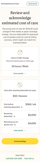
Cost estimate
Cost estimates were complex and highly personalized, requiring me to map multiple plan types, deductibles, and out-of-pocket scenarios. To avoid overwhelming families—especially on mobile—I used expandable design system cards to surface key costs first, minimized scrolling, and added tooltips to explain insurance terms.


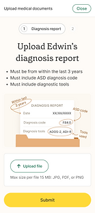
Document collection
I iterated through multiple low-fidelity versions before finalizing the upload flow for two required documents: the diagnosis report and ABA therapy referral. The final design emphasized clear document requirements with visual guidance to reduce rejections, and simplified the experience into a two-step process with pill indicators to show progress and status.


.png)
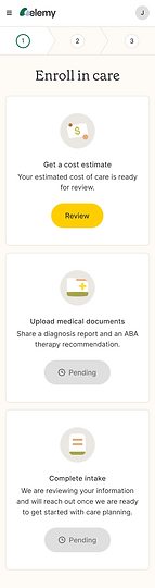
Document upload
I added a medical document upload task card in the parent portal, consistent with the cost estimate pattern. After submission, the card updates to a “Pending review” state to clearly signal that Ops team is reviewing the documents.

06 The Impact
Measured 3 months after launch
12%
Contribution margin improvement
16%
Marketplace CAC improvement
100 days
Manual work saved annually
(calculated based on reduced time stats)
07 Reflection
Replacing human touchpoints with self-serve workflows reinforced the importance of clear guidance, error prevention, and lightweight task design. Structured onboarding works only when it feels approachable, not overwhelming. Providing immediate confirmation and status feedback helped families feel progress and closure, increasing motivation to complete remaining steps.
